
What does the Cancel button exactly do? It dismisses the user’s current screen and brings them back to their previous one. Users rely on this dismissive button as a safeguard to prevent unwanted changes to the system.
To make your users feel safe, the Cancel button should signify a fallback to safety, not a call to action. This is why Cancel buttons should never have a color.
Colour on buttons signals a call to action. A Cancel button is not a call to action because no changes to the system occur after it’s pressed. Therefore, never emphasize it with color, otherwise, you’ll give users that impression. Instead, give them the impression that the button won’t make changes to the system and is their escape from action.
The Cancel button should have a neutral color to signify the neutral, non-committal button. When users notice that the Cancel button is without color, they’ll recognize it as the fallback to safety quicker. This is essential for users who activate a confirmation screen by mistake and want a quick escape.
When each button on a screen has a color, they’re competing for attention. This causes users to ponder each action longer. A neutral colored Cancel button makes it faster for them to decide by not competing. Users who are prepared to take action won’t get distracted by the Cancel button.
Not all Cancel buttons have a “Cancel” label, but they function the same as one. For example, a Cancel button could have the label, “Not Now”, “No Thanks”, “Maybe Later”, or “Skip” depending on the context. If the button has a dismissive behavior, treat it as a Cancel button because it serves the same function.
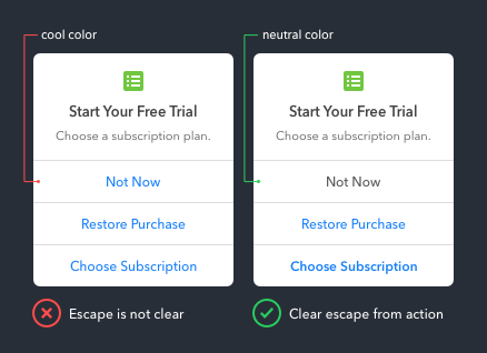
The more buttons there are on a screen, the more necessary a clear escape is. When all buttons have a color, the escape isn’t clear. But when the Cancel button is a neutral color, it makes the button choices more intuitive.
When using gray on a button, it’s important to make the gray dark enough. Otherwise the button isn’t legible and may look like it’s in a disabled state.